Do you want to add multi-column content in your WordPress posts? Columns can be used to create engaging layouts for your posts and pages.
Traditional print media, like newspapers and magazines, have been using multi-column layouts since the very early days of printing. Their goal was to make it easier for users to read the smaller text while utilizing the available space economically.
Single column layouts are more commonly used on the web. However, multi-column grids are still useful for highlighting content and making it easier to scan and read.
In this article, we’ll show you how to easily add multi-column content in your WordPress posts without writing any HTML code.
Adding Multi-Column Content in WordPress – The Easy Way
Creating multi-column content aka grid column content in WordPress is now easy because it comes as a default feature. The new WordPress Block Editor Gutenberg includes a columns block.
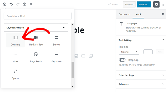
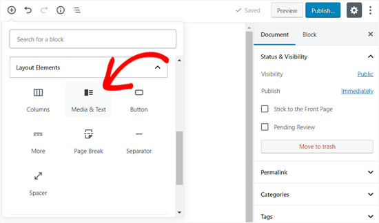
To add a multi-column layout, you need to create a new post or edit an existing one. Once you’re in the post edit area, click on the ‘Add’ icon on the top to add a block.
Next, you need to select the ‘Columns’ block located under ‘Layout Elements’ tab.
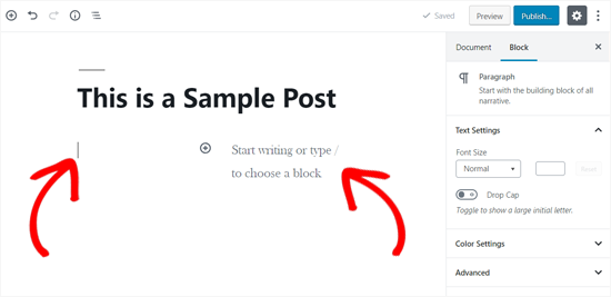
You will now see the mouse cursor jumping on the left column and a text placeholder will appear on the right column.
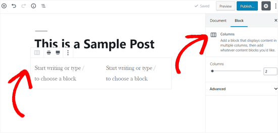
As you can see in the above screenshot, the Columns block seems just an empty area at first. If you mouse over to the left, you can see the block border highlighted.
You will also be able to see the block settings on the right column of the post edit screen.
By default, the columns block will adds two columns. You can increase the number of columns you want to add from the block settings on the right. It allows you to add up to six columns in a single row.
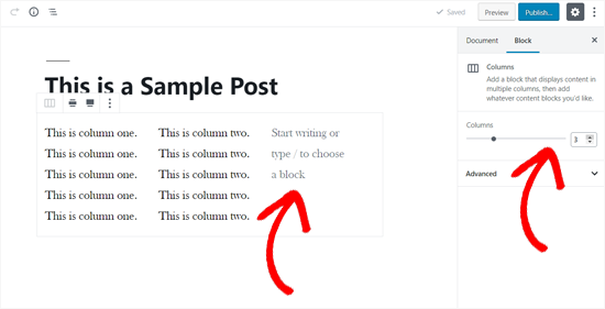
Simply click on a column and start typing to add content. You can use the tab key on your keyboard for switching to the next column.
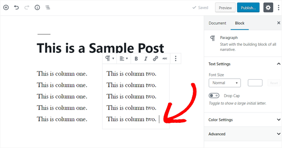
Adding Media and Other Content in Your Columns
In addition to the text content, you can also add images and embed videos in WordPress columns.
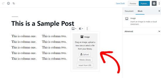
The columns block allows you to add blocks inside each column. Simply take the mouse to a column, and you will notice the ‘Add new block’ icon inside it. You can also add a block by typing / and then the block name.
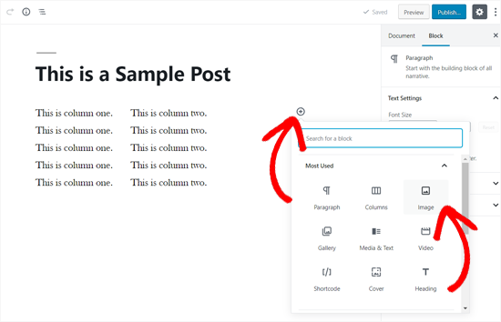
Your selected block will now appear inside the column. You can now go ahead and add content to it.
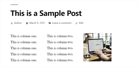
Here’s how your new column may look in the default Twenty Nineteen theme. In this example, we are using three columns and the last column contains an image.
If you only want to add an image and some text next to it, then you can also use the ‘Media and Text’ block instead of columns. This particular block is made specifically for showing media like images and videos next to some text.
Adding Multiple Columns in Old WordPress Classic Editor
In case you haven’t upgraded your WordPress to Gutenberg and still using the Classic Editor, then you’ll need to install a separate plugin for creating a grid column layout.
First, install and activate the Lightweight Grid Columns plugin. For detailed instructions, follow our step by step guide on how to install a plugin in WordPress.
Upon activation, you can create a new post or open an old post to edit. Next, click on the ‘Add Columns’ button from the visual editor toolbar.
![]()
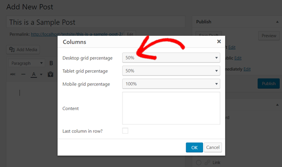
Now you will see a popup window to add your first column. You can choose how much area your column can cover, in desktops, tablets, and mobile devices differently.
For example, if you set the desktop grid percentage 50%, your column will cover the half row.
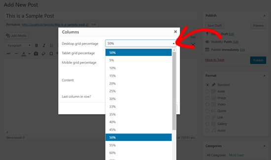
There’re plenty of options to set your column width, from 5% to 100% in the interval of 5. You can choose one by clicking the dropdown.
After that, you need to add your column content in the ‘Content’ box and then click the “OK” button to insert it into your post.
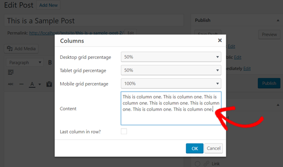
The plugin will now generate the required shortcode with your content and add it to your post editor.
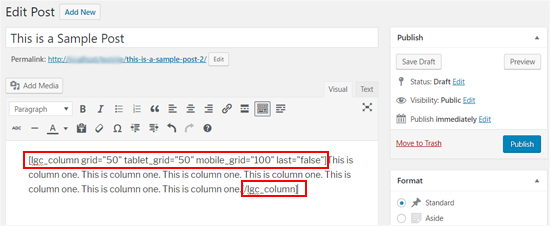
Now that your first column is added, you can repeat the process to add more columns. For the last column in row, don’t forget to check the box ‘Last column in row’.
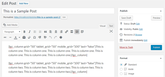
After that, you can save your post and preview it. Here’s how it looked on our test site using Twenty Seventeen theme.


